Saturday, 21 June 2008

Paint and Print on Canvas


Paint and Print is a project that I have recently taught at a local secondary school. The students who created these canvases are in Year 7 (11 and 12 year olds). I hope you will agree that they did a fantastic job by producing amazing art work designed by themselves.
The aim of the ten week project was to make a large piece of wall mounted art, using different techniques of painting and printing. The brief was for the students to study different styles of masks and their meaning including tribal, Venetian, theatre and horror masks.

The objectives of the project were:

to explore various types of paint and print media

to understand the properties and limitations of the paint and print media

to use color theory to obtain a satisfactory outcome

to make their own printing tools

to consider the elements of good design
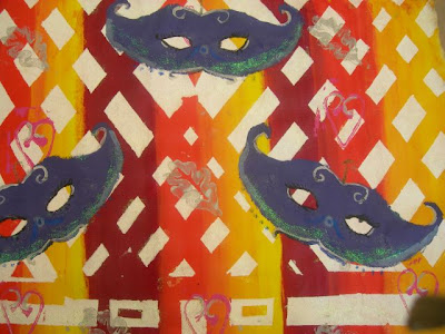

So how was it done? First the students were asked to select either cool colors or warm colors and, using diluted acrylic paints, applied these to the surface of the canvas using sponges.
Once dry, masking tape was placed on the painted canvas and a thick coat of acrylic paint was applied with a sponge. The students then had the choice of applying different printed elements to the canvas either with the masking tape intact or removing the masking tape before printing.
The printing applications were as follows:
bubble wrap and/or corrugated cardboard, painted with a thick layer of acrylic paint.
Collograph (string on card) printing blocks, painted with metallic acrylic colors before applying to the canvas.
Printing foam scored with a pencil and printing ink applied with a roller before applying to the canvas.
Commercially bought foam stamps painted with acrylic paint before applying to the canvas.

Once the surface had been decorated and the masking tape removed (tearing off the masking tape is such fun)! the canvas was ready for the masks. Each student made a template of a mask from paper and positioned the template onto the canvas before drawing around it with a soft pencil. The mask was painted in a solid color and, when dry, decorated with Jones Tones foils on a transparent glue base.


The Learning Outcomes. As well as learning about planning and design compostition, color theory and the properties of paint, the students also learned that materials behave differently on different surfaces. One of the "problems" of painting on an absorbent surface, such as on fabric or on a wall, is that a dense surface will absorb color but reflect very little light back (unlike white paper, for instance). For example: purple acrylic paint applied directly from the bottle will look black on a non-reflective surface. To achieve a better purple it is advisable to add a small quantity of white paint. Although the paint looks lilac on the palette it will dry to a darker shade. Another problem of color on canvas is one of contrast. Subtlties in shades and tints are lost on a large surface that is viewed from a distance so it is better to employ color "jumps". What I mean by that is, the subtle changes from yellow to tangerine, to orange, to vermilion, to red will be lost in this type of painting. It is advisable to change colors from yellow- orange - red without the subtlties in between.

A further limitation is that of paint handling and working cleanly, particularly in printmaking. Acrylic paint is notoriously difficult to manipulate when painting complex shapes onto thick absorbent canvas and students learned to mix the paint to the exact consistency to make its application easier. Printmaking is a messy business and students were advised to clean their area and printmaking tools thoroughly, particulary as they used oil based inks and turps to clean them up with.


Each student created a unique piece of art, using techniques that can be applied to other painting and print making assignments. a project such as this can be adapted for any age group, the older the student the more elaborate the finished piece can be.

Friday, 13 June 2008

Our Front Garden

Our front yard is tiny but I have managed to cram a path, patio and lots of plants into it. Amongst the flowers I am growing parsnips, carrots, mangetout, and strawberries. At the moment all the flowers are delicate colours but the summer blooms of lily, crocosmia (Lucifer), nasturtiums and marigolds are beginning to show.


The space is so small that I lean over the garden wall to weed it. Still, I find lots of wildlife there - including birds, insects, the occasional sleeping cat and the scourge of my garden, slugs!


I need to grow some herbs in the yard as they are good space fillers and smell good when I am out there. In the autumn the virginia creeper will turn red against the wall and make a bit of a show. A garden is a constant work in progress and I need to replace the ugly lavender bushes that I bought last year with a dwarf Munstead variety along the edge of the path.


Of course, I'm not the only person who likes to blog about her garden. Shasglasscrafts grows magnificent iris in her garden in Tennessee and she has a lot more space to play with than me!

Sunday, 25 May 2008

Glass Fish

One of my favorite glass items is fish. They are great fun to make because I can play with so many different combinations of colors.


Here is Sammy, a pendant made by Smokeylady54, using one of my glass fish in her creation. She has added her opwn lovely lampwork beads and leaves, as well as pearls and Swarovski crystals. The toggle on this piece is Sterling silver and the necklace is just under 22" long.


Sammy is for sale at Smokeylady's Etsy store . I also have some glass fish in my Etsy store too. Below are "Sid and Nancy", two punky fish waiting for a home.

Tuesday, 20 May 2008

Inspiration is all around

My two previous blogs about Sources of Inspiration looked at becoming "ideas-rich" and ways of presenting ideas for design (sketch books, design boards, scrap books etc).

Even the most mundane items can become a source of inspiration, you don't need to search the net for good design ideas, you are living with them. Here I have taken my camera to record a few ideas from around the home, focussing on color, texture and pattern. Textiles and tableware are both a great source for ideas and take a look in the fruit bowl too!


Any of these images will be useful to the glass artist, textile designer or graphic illustrator.
I am also addicted to glossy magazines and catalogues from shops such as The Pier which are packed full of color, texture and pattern. I keep a small note book with themed pages and, when I am stuck for inspiration, I take a few minutes to look through this book. Below are some example pages.

Colors of Provence, France

Natural color and texture


Black, cream and white
Why not browse Etsy and buy yourself a note book to keep your ideas? To view more pages from this notebook visit my Flickr.

Friday, 9 May 2008

A Walk to Bronte Falls

Last Bank Holiday Monday 5 May we took the dog for a walk to Bronte Falls. Here he is, keen to get moving.

We walked from Penistone Hill in Haworth to the Falls, a short walk of roughly 4 miles there and back, no strenuous climbing, just a gentle path. We could see across the valley to Stanbury and Oldfield. Below is Stanbury village.
The weather was hot and hazy, therefore the light quality was quite poor. This image is looking across the valley toward Lancashire, the Falls are below.
Once there we stopped to sit and paddle our feet in the beck. The original bridge was washed away in a flood so the Bronte Society paid to have a new one made. I don't know if the Falls had a name in the 19th century (someone enlighten me) but they are now named the Bronte Falls because the sisters lived at Haworth.


We intended to walk up to Top Withens, a ruin of a farmouse, said to be the inspiration for Wuthering Heights, but I had forgotten to bring a drink and, as my tongue was dragging on the ground from thirst, we walked back into Haworth and adjourned to the pub.


Here is Jackson, entertaining himself and anyone who was passing, by digging for stones in the beck.